The Meaning Behind the LAS Logo — More Than Just Letters
A logo is often the first introduction to a brand. It is the silent signature that represents everything the brand stands for. The logo of LAS By Ananya was created with the same philosophy — simple in appearance, yet meaningful in every line.
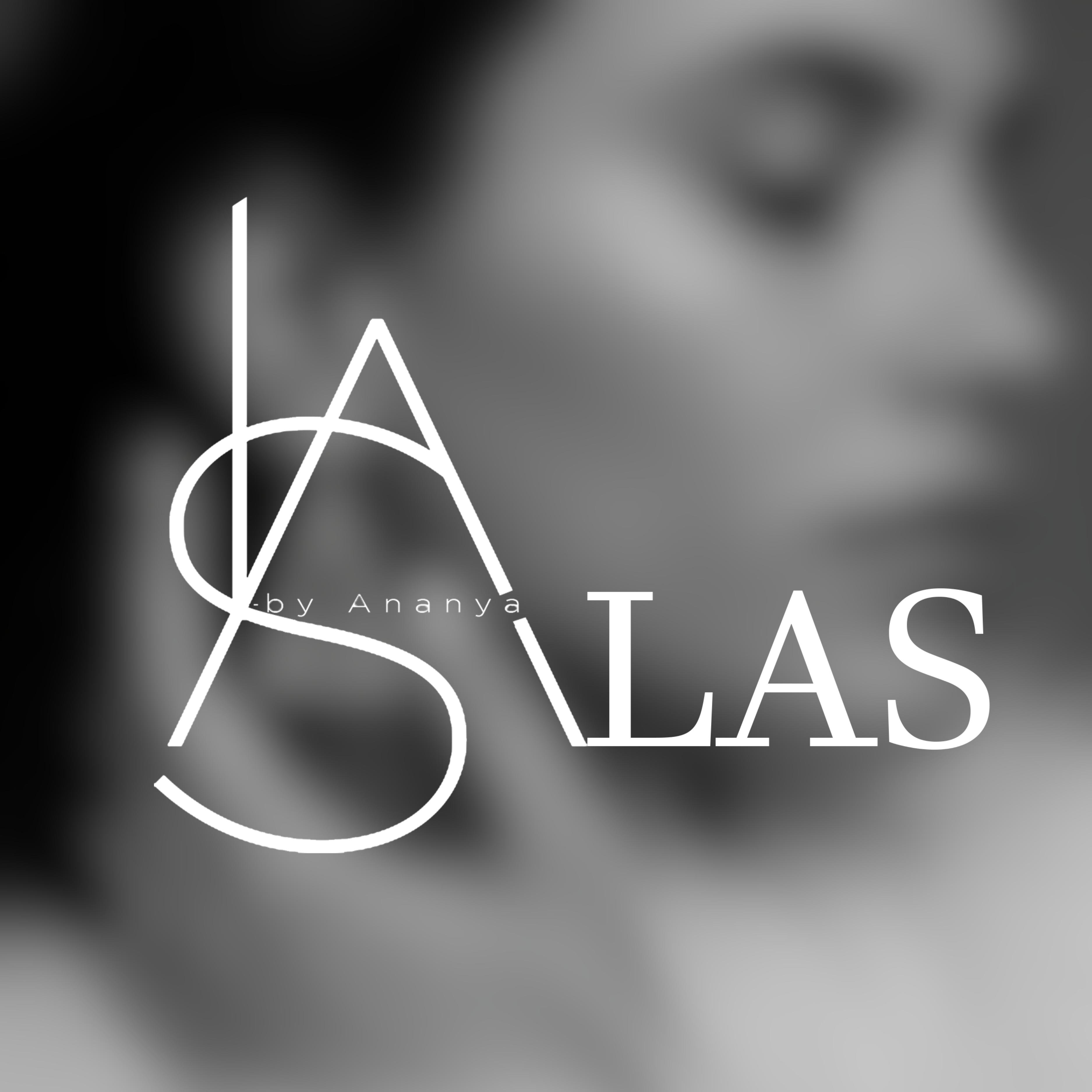
At first glance, the design looks minimal and modern. But when you look closely, the lines form something deeper — the three initials L, A, and S, representing LAS.
This is LAS — drawn with intention, worn with pride.
A single stroke that rises fearless — L for the Leader within you.
An angular peak that stands bold — A for Ambition that never settles.
A fluid curve that moves with grace — S for Style that speaks without words.
Together, these three elements create balance. Strong lines meet soft curves. Structure meets flow. Minimal design meets deep meaning.
The monochrome black design reflects confidence and timelessness. Black never goes out of style, just like true elegance. It also represents clarity — a reminder that simplicity often carries the strongest impact.
The intertwined letters show connection — between design and identity, fashion and confidence, the brand and the people who wear it.
For us, the LAS logo is not just a graphic. It is a symbol of individuality, strength, and expression.
Every time you see the LAS mark, remember — it is not just a logo.
It is a statement of style, ambition, and confidence.
LAS By Ananya — Where Strength Meets Style.